I watched an excellent online course about data visualization. (Nerd!) In a nutshell, the presenter explained the pros and cons of different types of charts. Which one are easier to understand? Which answer your questions?
Naturally, I spent the whole time thinking how to use these ideas for genealogy.
My first thought was DNA results. Ethnically, my parents and I are all Italian. Their ancestors all came from a very small area of Italy. I've traced all their lines back to the late 1600s, and no one moved. Not until 1899 did we start to become American.
Our 3 DNA test results have changed over time as the database grew and algorithms improved. I would like to see how each of my parents influence my DNA, and how we all compare to one another.
 |
| These 4 charts show the same information. But which one best answers the question at hand? |
An Excel spreadsheet is a very simple way to generate all kinds of charts. First I entered some basic information.
- Mom, Dad, and I are the 3 rows in the spreadsheet.
- We each have 3 DNA ethnicities, so these are the 3 columns in the spreadsheet:
- Southern Italy
- Greece & Albania
- Northern Italy
For each of us, I entered our percentage of each of the 3 ethnicities.
To create a chart based on data, select all the data in your table, including the names of the rows (Mom, Dad, Me) and columns. (Click your mouse in the top left cell, A1, and drag your mouse to the bottom right cell.)
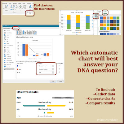
With the data selected, go to Excel's Insert menu. In the Charts section of the tool ribbon, click in the lower right corner to See All Charts. On the new window that opens, click the All Charts tab. Now you can click through lots of options to see a preview using your actual data.
When you select a type of chart, it will appear on your spreadsheet. You can click and drag that chart anywhere on the page. Once you click a chart, you can click the paintbrush icon to change the style of colors. And you can give it whatever title you choose.
Based on the online course I watched, I chose 4 types of charts with different qualities. Each one shows how my DNA compares with that of my parents.
1. In the Custom Combination chart (top left in the image above), my parents (green and blue bars) have similar DNA. The yellow line (representing me) shows that I have:
- a touch more Southern Italian DNA than either of my parents
- a good deal more Greek/Albanian DNA than either of my parents
- a good deal less Northern Italian DNA than either of my parents
This is a good chart because it clearly shows what I wanted to know: how do I compare to Mom and Dad?
2. The 100% Stacked Column chart (top right in the image above), we see a different visualization. But there's bit less clarity. You can't see from this chart that I have more Southern Italian DNA than my parents. But you can see that I have a lot more Greece/Albania, and a ton less Northern Italy.
3. The Scatter Chart with Straight Lines and Markers (lower left in the image above), is clearer than chart 2. You can see that I have:
- the most Southern Italy, but not by much
- the most Greece/Albania, by a decent amount
- the least Northern Italy, by a lot
Strangely, the ethnicities don't appear on this chart.
4. The Clustered Bar chart (lower right in the image above) . This is a better comparison of the 3 of us than charts 2 or 3. Why?
- You can see how we "stack up" to one another in each of the 3 ethnicities.
- The percentages are pretty easy to see.
Chart 1, the Custom Combination chart, is the best choice to answer my initial question. When I first created this chart, the bars were me and mom, and the line was dad. Then I realized that when you're choosing the type of chart to create, you can set who gets the line and who gets the bars.
Before I created these charts, I had to keep switching DNA results on Ancestry to get an idea how we 3 compared. It was a revelation to me that I wound up with more Southern Italy and Greek/Albanian DNA than my parents.
 |
| You can easily compare your DNA to that of one or many DNA matches. Which questions do you want to answer? |
If you don't manage multiple DNA tests, don't worry. You can create charts comparing yourself to as many of your Ancestry DNA matches as you want. When I view my 1st cousin as my DNA match, I can click Ethnicity to see his percentages. How interesting! He has a lot more Northern Italy than I do, but he has no Greek/Albanian at all.
Imagine charting a group of your DNA matches' ethnicity percentages in a spreadsheet. What might you learn from charting the data? What do you want to learn?


