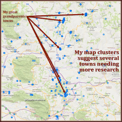
A couple of years ago I was looking at a map I bought while on vacation in Italy. I realized all my ancestral hometowns fit into a small area of the map. My roots are extremely concentrated. They're all in one province (that's like a county in the U.S.), with one exception that's just over the border.
Here's the part that amazes me. My grandparents and one set of great grandparents met and married in America. But their roots were in neighboring towns in Italy. You may have similar stories in your family tree. Of course immigrants felt comfortable in neighborhoods where everyone spoke the same language. And they felt even more comfortable when their neighbors spoke the same dialect. Imagine how much that helped them make the transition to their newly adopted country.
Generating Your Roots Map
This week I wanted to see a visualization of not only my ancestors' towns, but all their birthplaces on the map. I turned to a program I tested 2 years ago: Microsoft's Power BI Desktop. (BI stands for Business Intelligence.) If you want to try this, see the 5 steps further down in this article. But here's how easy it is to create the map once you're in Power BI:
- Click the Map icon (which looks like a globe) and expand the graphic to fill the workarea.
- Drag the FactType field into the Filters column and check Birth in the list.
- Drag the SortableLocation field and drop it in the Location section of the Visualizations column.
Those 3 steps gave me 18,947 blue dots on my world map. (That's how many people are in the GEDCOM file I'm using.) I see a ton of dots covering the New York City area and scattering over to the Midwest where Dad was born. Italy is positively overrun with blue dots.
 |
| Each datapoint in your family tree can generate more research leads. |
I can use the scroll wheel on my mouse to zoom in on Italy. There I can see a huge cluster of blue dots from Naples in the west to Foggia in the east. I love this visual. This is the cradle of my civilization.
If you'd like to create this map for your roots, all the software is free. The only caveat is you must be using a Windows computer. Here's what to do:
- Download and install the free Microsoft program at https://powerbi.microsoft.com/en-us/desktop.
- Export a GEDCOM from your family tree program or website. You may want to filter your export to your blood relatives (your ancestors and all their descendants) or only your direct ancestors.
- Open your GEDCOM with Family Tree Analyzer (https://ftanalyzer.com) and choose to Export Facts to Excel. (It will actually be a CSV file.)
- Open the CSV file to see if there are any columns you don't want. I noticed start date and end date columns, and 2 columns up front, that I decided to delete. Save your changes.
- Launch Power BI Desktop and choose to Get Data from your CSV file.
Now you're ready to create your map by following the 3 steps I outlined at the top of this article. It makes me proud to have such a tight cluster of roots. Having clusters all over the world might make your existence more of a miracle.
Following the Trail Wherever It May Lead
My Italian cluster is why I spend all my time indexing and exploring vital records from these towns. Even if someone is in my tree due to marriage only, they are me. They're all me.
I'm even expanding into other neighboring towns. I was trying to track down the family of a DNA match when I realized her ancestor's last name exists in the next town. I started scouring that town and found her ancestor's 1842 birth record. And I saw a handful of familiar last names there.
 |
| The nearby dots, towns next to your ancestral towns, hint at future family tree research. |
I have more than enough towns and data to keep me exploring and discovering for the rest of my life.
Are your map clusters telling you to research a new town? Look for nearby dots on your map. Maybe your ancestor married someone from the next town. It may be time to expand your search.
No comments:
Post a Comment
You may leave an anonymous post if you have no Google account. The author screens each comment for spam before it appears here. So don't bother to spam.